


Classic Woodland Baby Boy Nursery Reveal

In December of 2022, we found out that we were having a second baby! We were fortunate to welcome our son in August of 2023. I wake up some mornings and still just can't believe that we have two amazing children. I am so thankful for this time at home as a family of four.


We found out the gender of our second child while we were at Walt Disney World with both sets of grandparents! It was fun to find out with our daughter and see her excitement. We decided to move our daughter into a new, big girl room (that post coming soon) and update the nursery for our son. There were several tears shed in the process of transitioning the nursery from her room to his. It was such a bittersweet time. Her nursery was a special room to me and where I spent most mornings before she was born for my quiet time and coffee. I was excited to welcome a new little one to our family, but worried about the transition for her and honestly, for myself. It is a privilege to watch our children grow up. But, like any parent knows, it is also a little hard on the heart and truly goes by too fast.
BEFORE: The nursery decorated for our daughter

Nursery Design Inspiration
I love classic and traditional nursery styles and wanted the room to feature soft colors. The Pinterest inspiration I kept pinning featured creams and soft blues/greens. I did not have my mind set on a particular theme, but more so envisioned the colors and the feeling I wanted to have in the nursery. I envisioned a calming space, but something to transition with our son as he grows. We knew we would be using our guest room furniture (Austin's furniture growing up) and reusing our crib. I needed to figure out how to blend the dark furniture with the cream and gray crib. We planned for the kids' rooms to both mirror each other as they are side by side. I knew I didn't want to walk past a totally pink bedroom and blue bedroom side by side. I wanted their rooms to flow with the colors of the rest of our home, but still feel like fun kid rooms to them as they grow. Both rooms have one accent wall and the other three walls are painted Swiss Coffee by Benjamin Moore. This is one of my favorite paint colors. It is so warm and cozy, but also lightens up a space and pairs well with many colors. We used this color in the main living spaces of the Bee House.

We went with a board and batten accent wall in our daughter's room, however the layout in the nursery made it difficult to do something similar. We decided that doing board and batten two-thirds up the wall around the room with paint or wallpaper above may make the small room feel more confined. I searched for the perfect wallpaper that could be treated like a mural for the accent wall and bring in the colors I wanted for the space. I ordered several different wallpaper samples from Wallpaper Direct. Wallpaper Direct is my favorite sourcing site for high quality paper at great price points and samples are free. We landed on this beautiful woodland wallpaper "Up North" by Borastapeter. When I say it was the perfect match and made the room, it totally did! The background of the paper is basically the same color as Swiss Coffee. I loved the soft blue and green in the paper and how it pulled in brown, gray, and other warm colors with the cream background. Austin and I did all of the painting ourselves and my mom and dad hung the wallpaper.
Once I had chosen the wallpaper, my mom and I went fabric searching. We found the stripe fabric at Shelby Fabrics (local store) at a great price point and it had the perfect colors and simple pattern for what I envisioned for the curtains. I loved how the soft blue and gray stripes were outlined with a darker blue on the cream background. It's hard to tell in the pictures of the room, but up close the fabric is so beautiful. Shelby Fabrics is usually our first stop when looking for fabric as they have competitive pricing and a great selection. Just plan to be there awhile because there is a lot to look through! I selected these brushed gold French return style rods from Amazon for both kids' rooms. This allows us to be able to block out more light than a standard rod and opening/closing the curtains is easy. It also worked well for the window behind the rocker that is in a tight corner. The window position prevents any kind of decorative finial on a curtain rod or the ability to hang curtains past the window the way interior designers suggest.


Nursery Decor Links & Sources
For decor, I wanted to keep things pretty simple with the same soft colors in the fabric and wallpaper. I sourced the artwork and name signs from Etsy. Both shops I used were fabulous to work with and customize for exactly what I wanted. I've really grown to love Etsy shops for home decor and supporting small businesses. Some items, like the shelves and glider, we used with our daughter and purchased almost four years ago. The nursery is done, except for incorporating newborn photos and Mason's quilt. I'll be sure to share some updated photos when those things are added!
(Scroll over the images and click the image for links)

Woodland Alphabet Print 
Similar Baskets 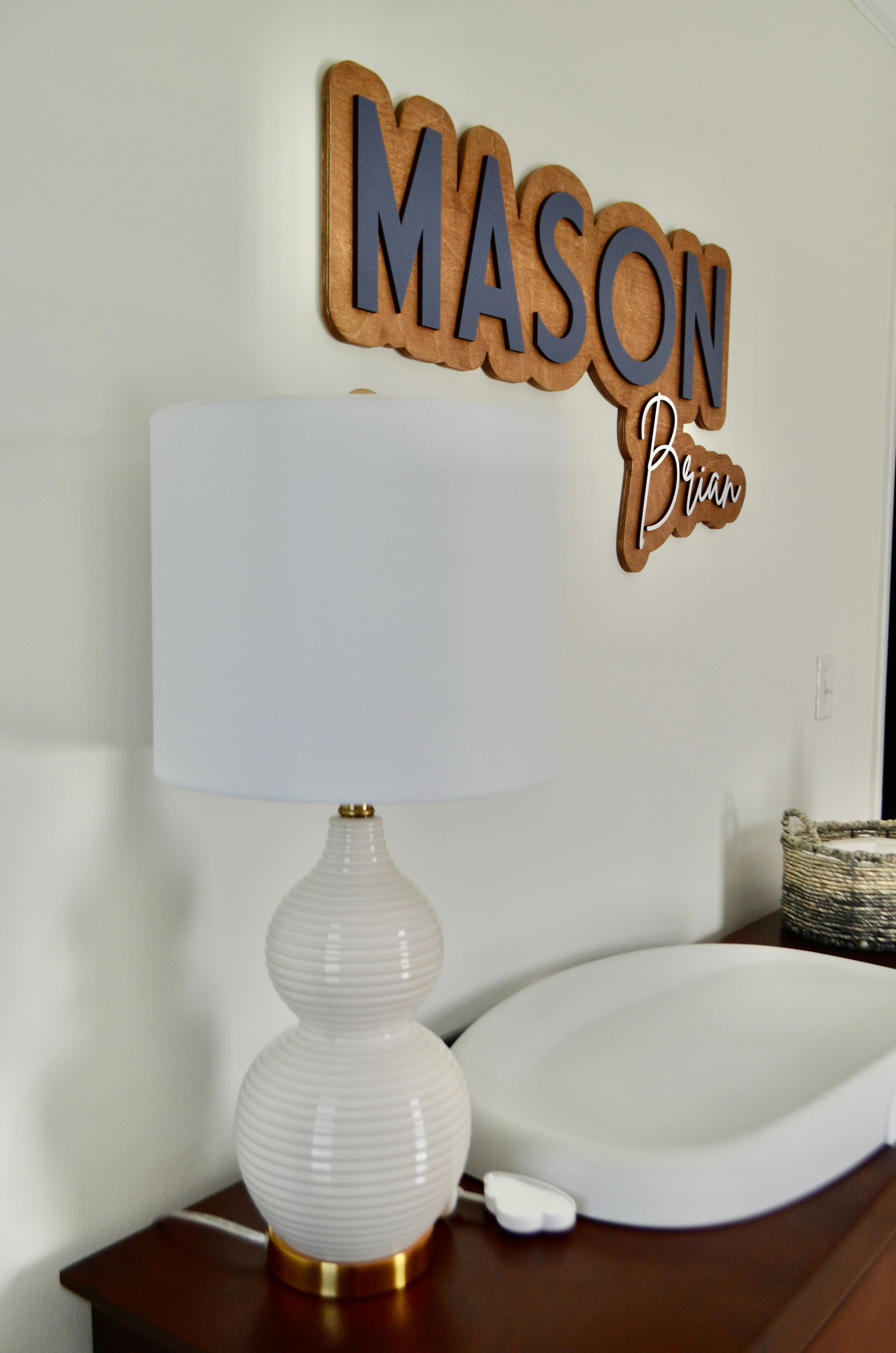
Custom Wooden Name Sign 
French Return Curtain Rods 
Toy Storage 
Nursery Wallpaper 
Under $100 Flush Mount Light 
Safavieh Emery Table Lamp 
Swivel Rocker with Storage 
Floating Shelves (Set of 3) 
Scallop Step Stool 
Crib Sheet
Some things to know about my decor sources:
For the Woodland Alphabet, I purchased the digital print and used Smallwoods home to have it printed and framed on canvas. This process was extremely easy and I was very pleased with the final product.
For the name sign, the Etsy shop has a virtual designer where you can see exactly what you are asking them to make. I am very visual and this was so helpful.
The matching oval baskets on the dresser (to hold wipes and other diaper essentials) and the smaller one on the chest of drawers were from Hobby Lobby. I cannot find them online. I linked very similar baskets from there above.
I purchased the Scallop Step Stool at a Pottery Barn Outlet for under $50. It is the perfect thing to help big sister feel like she is getting to help take care of baby brother.
Contact us or leave a comment if you have any questions about any sources, design, or decor items!
- Meredith


Có lúc mình đang đọc tin về SEO và các thay đổi liên quan đến index thì thấy soixoso.net xuất hiện trong danh sách mình đang xem. Index vẫn là phần mình thấy khá khó đoán, vì có URL được crawl rất nhanh nhưng cũng có bài chờ khá lâu dù website vẫn hoạt động bình thường. Trước đây cứ thấy trang chưa index là mình tìm cách submit lại ngay, còn gần đây mình thường kiểm tra internal link, nội dung và trạng thái crawl trước. Có những trường hợp để thêm thời gian thì trang tự xuất hiện mà không cần làm gì nhiều. Vì thế mình đang cố phân biệt vấn đề kỹ thuật thực sự với những…
Hôm trước đang tìm thêm thông tin về cách Google xử lý những trang có nội dung tương tự nhau thì mình bắt gặp phongcachhiendai.net. Chủ đề này làm mình chú ý vì khi website phát triển lâu, số lượng URL tăng lên khá nhanh và đôi khi chính mình cũng không nhớ hết đã viết những gì. Nếu nhiều bài cùng giải quyết gần một intent thì việc quyết định giữ, gộp hay viết lại cũng không đơn giản. Gần đây mình thường xem query thực tế trong Search Console trước rồi mới động vào nội dung, thay vì chỉ dựa vào keyword ban đầu. Cách này giúp nhìn rõ hơn Google đang hiểu từng URL theo hướng nào.…
Mình tình cờ gặp echoreach.net trong lúc đang xem một số tin tức và thảo luận mới về SEO. Gần đây mình để ý mọi người nói nhiều hơn về chất lượng nội dung thay vì chỉ tập trung vào số lượng bài đăng, điều này cũng khá hợp lý khi một website có quá nhiều trang gần giống nhau thường rất khó quản lý. Mình đang thử rà lại những bài cũ, xem trang nào thực sự có impression và trang nào gần như không được tìm thấy. Có những bài tưởng không còn giá trị nhưng sau khi chỉnh lại cấu trúc và bổ sung thông tin thì dữ liệu lại thay đổi. Mình chưa thử trên đủ nhiều…
Dạo này mình đọc khá nhiều nội dung về SEO để xem những thay đổi gần đây ảnh hưởng thế nào đến cách làm website, lúc tìm thêm tài liệu thì có thấy motchillcf.net được nhắc đến. Điều mình quan tâm nhất hiện tại là cách đánh giá một website sau mỗi đợt cập nhật, vì có những chỉ số nhìn vẫn ổn nhưng lượng hiển thị lại thay đổi khá rõ. Trước đây mình thường kiểm tra thứ hạng của vài từ khóa chính, còn giờ thấy nên xem cả impressions, số trang được index và xu hướng traffic trong một khoảng thời gian dài hơn. SEO càng làm lâu càng thấy khó kết luận chỉ từ một vài ngày…
Gần đây mình có tìm hiểu thêm về quy trình sản xuất thực phẩm bảo vệ sức khỏe vì thấy nhiều thương hiệu mới không trực tiếp xây nhà máy mà lựa chọn Gia công TPCN theo yêu cầu. Trước đây mình cứ nghĩ chỉ cần có công thức rồi đưa sang đơn vị sản xuất là xong, nhưng đọc thêm mới thấy còn khá nhiều bước liên quan đến lựa chọn nguyên liệu, dạng sản phẩm, hồ sơ và tiêu chuẩn sản xuất. Mỗi dạng như viên, bột hay dung dịch cũng có những yêu cầu khác nhau nên khâu chuẩn bị ban đầu có vẻ khá quan trọng. Mình đang quan tâm nhất đến việc một công thức từ…